How to Use Notion Charts: Full Tutorial
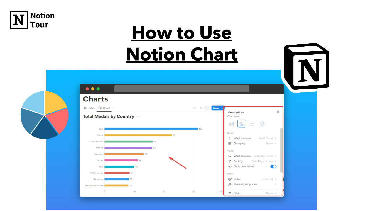
Notion is getting a suite for businesses to manage and analyze their business.
Notion is getting an all-in-one tool that you can use to collect data, store information, write on it, and operate your business with it.
Notion releases charts, a new feather that will allow you to analyze your data from databases in chart format. This was a much-awaited feather for the community.
Notion chart is available for one notion database in the free plan, get the paid plan to apply to multiple databases with many other pro features.
Let’s see how you can use the data in your workspace. Here is the step-by-step guide to Notion charts.
Note: Here is the Notion chart tutorial page if you want to test it.
1/ Create a database
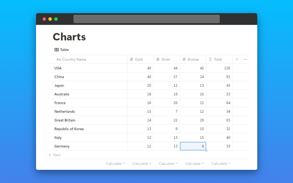
First, you need to create a new database or if you have an existing database that you want to try charts, that is also fine. For example, I made a new database and added the Paris Olympics 2024 top 10 results.
2. Click on “+” icon and select charts
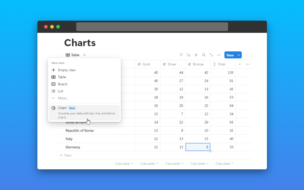
Then click on the “+” icon beside the table and you will see different types of views to select, select the charts option.
3. Customize the chart
After you have enabled the charts view you will have different types of settings. Let’s look at each of them.
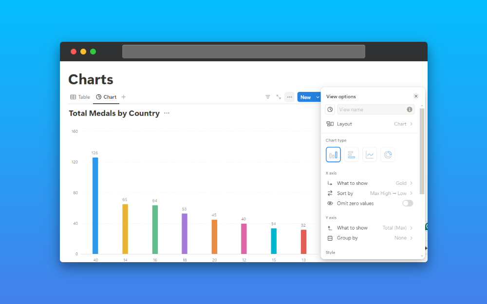
In the chart setting you have different types of charts.
- Vertical bar
- Horizontal bar
- Line
- Donut
Each of them has different settings.
Vertical Line Chart
In each type of chart, you have an X-axis and Y-axis setting. You have to set these two to show the type of chart you want to show.
I have taken the “total number of gold” and organized them by “High to low”.
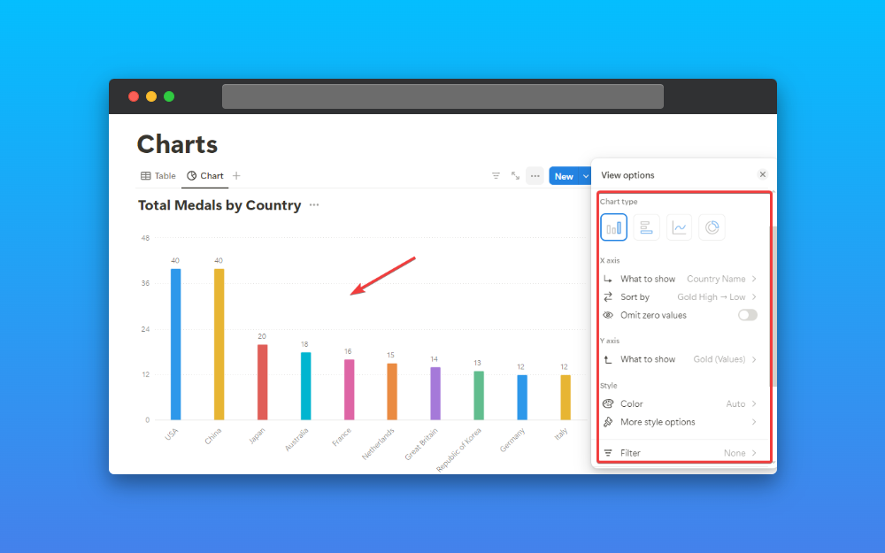
X-axis:
- What to show: Total
- Sort by: High to Low
- Omit Zero values: None (If you enable this option then it will omit if you have any zero value in the chart.)
Y-axis:
- What to show: Gold (Sum)
- Group by: None
You can also add colors to your charts.
Horizontal Bar Chart
You can add the charts in a horizontal bar with x-axis and y-axis settings. Here in this case I have taken “total no. of the medal by country”.
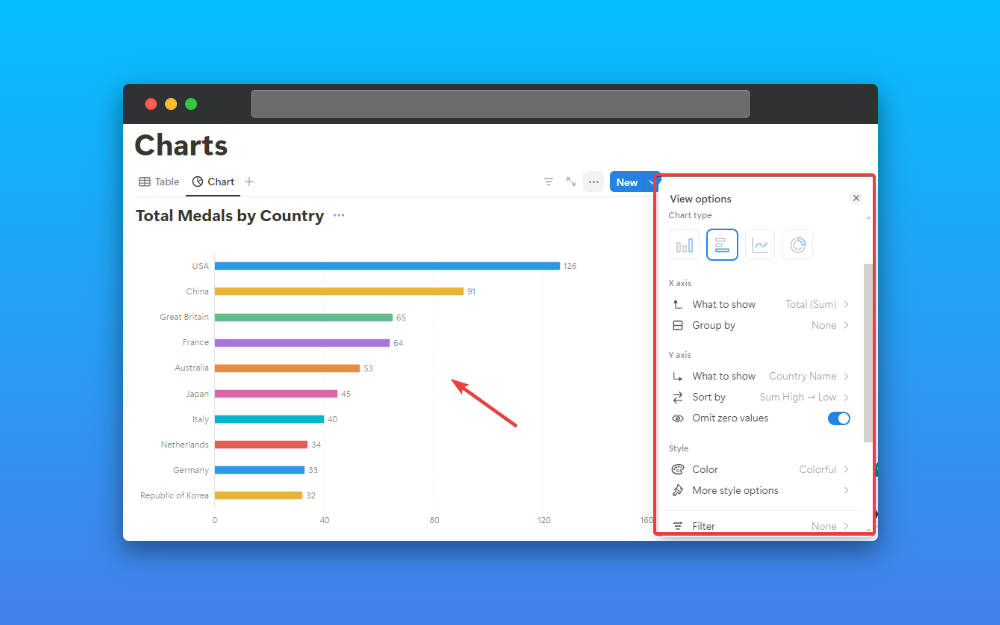
X-axis:
- What to show: Total (Sum)
- Group by: None
Y-axis:
- What to show: Country Name
- Sort by: High to Low
- Omit Zero values: Yes (If you enable this option then it will omit if you have any zero value in the chart.)
You have other styling options, like adding different colors, heights, grid lines, and more.
Line Chart
You can add a line chart with the same x-axis and y-axis values. In this tutorial, I have taken “total medals by country”.
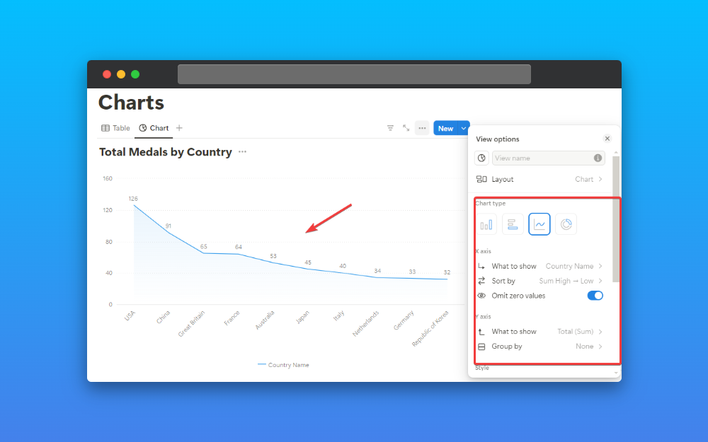
X-axis:
- What to show: Country Name
- Sort by: High to Low
- Omit Zero values: Yes (If you enable this option then it will omit if you have any zero value in the chart.)
Y-axis:
- What to show: Total (Sum)
- Group by: None
In this way, you can add a line chart to your notion database. You can experiment with different options here.
Donut Chart
The last chart type is a donut chart where you have a pie chart where you will show your data. You will not find the x-axis and y-axis here.
For this tutorial, I have taken “total medal by country” and let’s see the chart and settings for it.
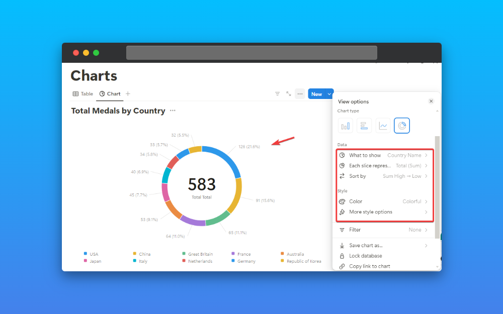
Here are the settings:
- What to show: Country Name
- Each slice represents: Total (Sum)
- Sort By: High to Low
You can add other styling options like height, show data value in the center, legend, and data labels.
Wrapping Up…
Charts were the much-awaited Notion feature and it delivered right. You can now present your data in a beautiful chart.
If you want to excel in charts then you should test the chart feature in multiple databases.
I have given the link to the notion charts tutorial page which you look at.
The notion chart feature is only available for one database if you want to implement the chart feature in multiple databases then you can purchase the Notion Pro plan.
